


The design journey began with deep immersion into the core themes of diving and yoga, ensuring the logo resonated authentically with the resort’s identity. Diving inspirations stemmed from the ocean’s vast, mysterious depths. “Azure” evokes the brilliant blue hues of tropical seas, symbolizing clarity, purity, and the allure of underwater worlds. Historical diving roots trace back to ancient practices, like free-diving in Philippine culture for pearl harvesting, emphasizing harmony with nature. I drew from natural elements: rolling waves, coral formations, and the fluid motion of divers gliding through currents. These translated the early logo concepts into curved, flowing lines that suggest movement and exploration, mirroring the adrenaline of descending into blue abysses.
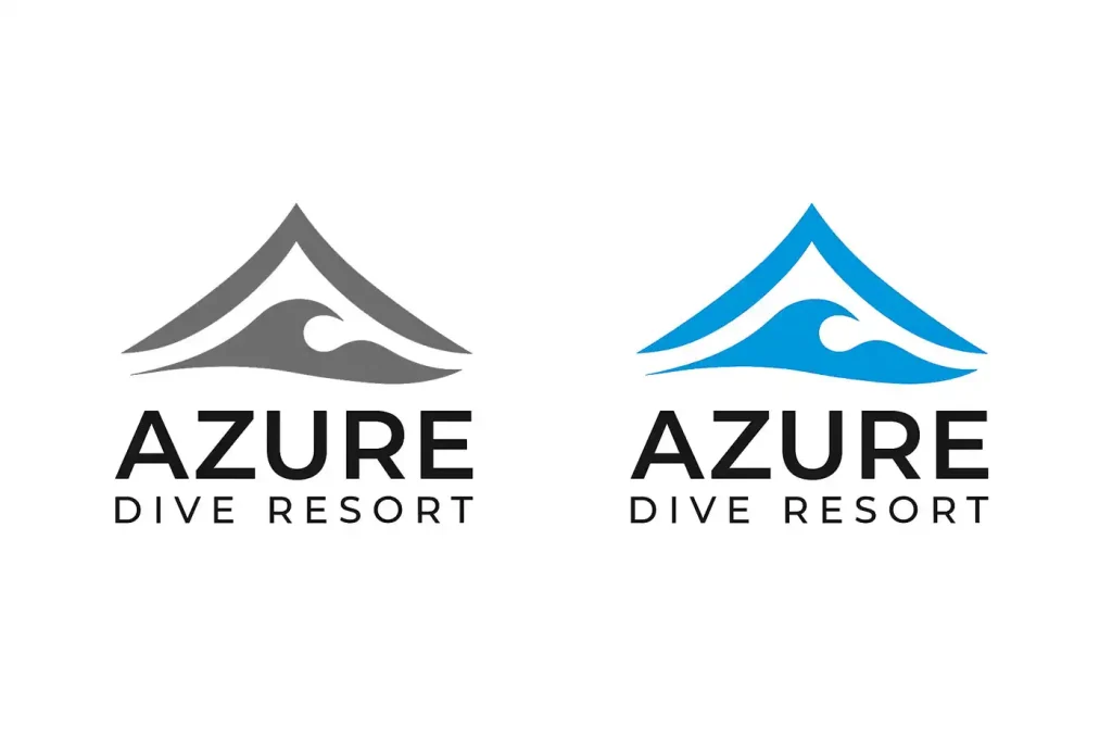
Initial Logo Concepts
Complementing this, yoga inspirations rooted in ancient Indian philosophy provided balance. Yoga, meaning “union” in Sanskrit, promotes mindfulness, breath control, and connection to the earth—ideals echoed in the resort’s beachside asana sessions. Key poses like Adho Mukha Svanasana, commonly known as Downward-Facing Do inspired mountainous silhouettes, representing stability, elevation, and inner peace. The peaks also symbolize the yogic concept of prana (life force), flowing like waves through the body. By fusing these, the logo bridges the physical (diving’s action) and spiritual (yoga’s introspection), creating a holistic emblem. Color choice was pivotal: a gradient of azure blue nods to ocean depths while evoking calming yoga auras, avoiding vibrant reds to maintain serenity. Three Adho Mukha Svanasana symbolism can also be represented as tropical huts roof apex connecting the resort to a leisure tropical paradise essence.
Environmental considerations influenced the design too. With climate change threatening dive sites like coral reefs, the logo subtly advocates sustainability—interlocking shapes imply interconnected ecosystems, aligning with the resort’s eco-friendly ethos.
Development Process
Feedback loops Ire crucial. Stakeholder reviews from resort owners emphasized versatility— the logo needed to work in black-and-white for merchandise and glow digitally for the website. Iterations addressed balance: early versions felt too chaotic, so I simplified to three interlocking forms, evoking the trinity of mind-body-spirit in yoga and the three stages of a dive (descent, exploration, ascent). Typography evolved from serif fonts (too traditional) to sans-serif boldness, ensuring readability and modernity.
Results
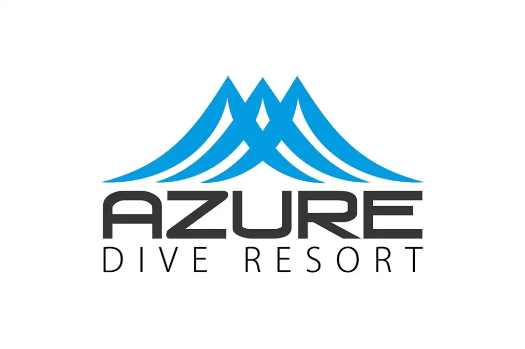
Azure Dive Resort Logo
The final logo successfully merges the spirit of diving’s adventure with the calm essence of yoga’s zen, resulting in a mark that was widely praised for its elegance and harmony. Beyond just a visual symbol, it captures the duality of energy and tranquility, reflecting the resort’s philosophy in a timeless way. This project demonstrates how meaningful inspirations, when carefully interpreted, can go beyond aesthetics to establish a deeper sense of brand identity.
Thoughtful design choices allowed the logo to become more than a graphic—it became an emblem of the resort’s story and values.
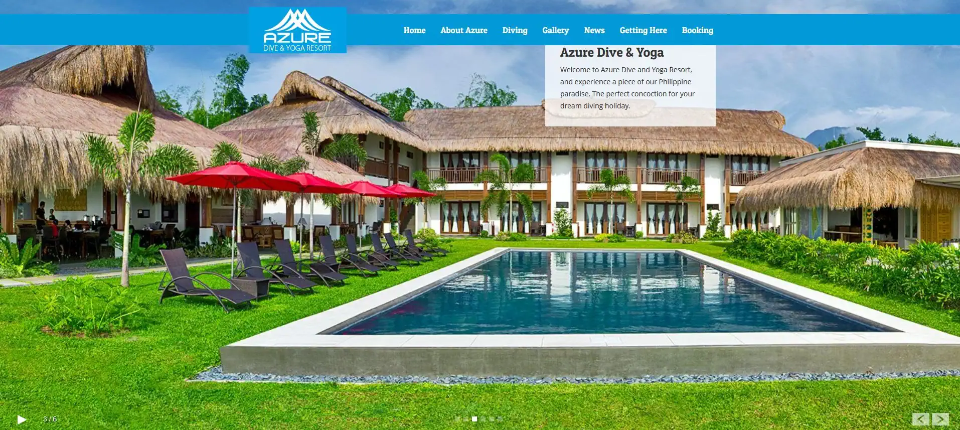
Azure Dive Resort Website Version 1 2013
The Azure Dive Resort logo integrated seamlessly into the very first version of the resort’s website. Its clean lines and balanced form enhanced the site’s visual appeal while reinforcing the brand’s personality from the very beginning of its digital presence. By complementing the overall layout and design of the website, the logo not only elevated the user’s first impression but also set the tone for how the resort is experienced both online and offline. This alignment of brand identity across mediums highlights the strength of cohesive design in building lasting recognition.